Contents
 Facebook Data Analysis Dashboard
Interactive Dashboards for Data Science
Creating an online dashboard in Python to analyse Facebook Stock Market Prices and Performance Metrics.
Introduction
Creating an online Data Science Dashboard can be a really powerful way of communicating the results of a Data Science project. A good Dashboard can:
- Summarise the main results of a data analysis.
- Enable the customers/company managers to test how varying some parameters can affect a certain outcome.
- Fetch continuously new data to update its graphs and summaries.
- Allow us to make predictions online using either pre-trained Machine Learning models or training them online.
Nowadays, there are many different services which can be used to create Dashboards. Some examples are:
- Dash by Plotly
- Bokeh Dashboards
- Google Data Studio
- Tableau
The first two examples require a good Python programming knowledge in order to create Dashboards, instead, the last two don’t necessarily require any programming knowledge (they provide although fewer customisation options).
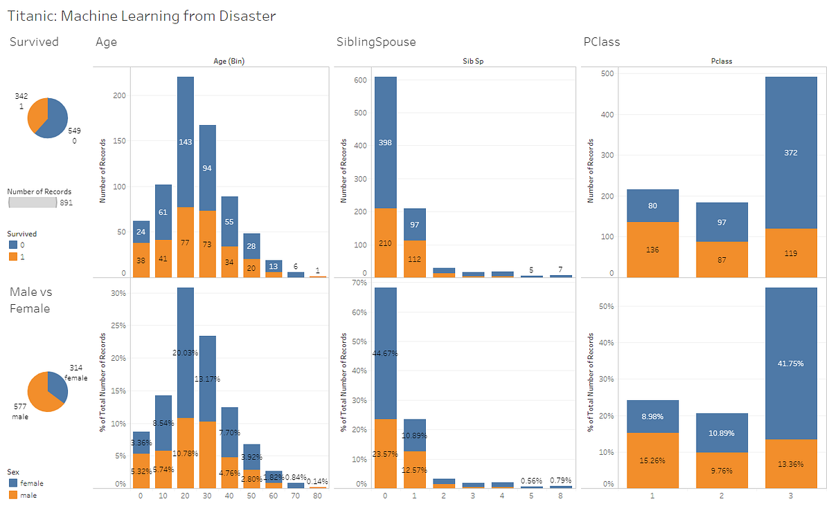
Figure 1: Titanic Data Set Dashboard made using Tableau.
In this article, I will walk you through how to create and deploy online a Dashboard using Plotly Dash. All the code used in this article (and more!) is available in on my GitHub account.
My final version of the Dashboard is available to be tested online at this link.
Dash

Figure 2: Dash [1]
Dash is an Open Source Python library designed by Plotly for creating reactive, Web-based applications. This library is built on top of other packages such as: Flask, Plotly.js, React and React Js.
Every Dash App is composed of two main parts:
- Layout = is used to define how all the content should be laid out on the application.
- Callbacks = are used to make each of the desired components of the Dashboard interactive.
Additionally, Dash provides a collection of HTML classes to generate HTML code in Python (dash-html-components), Markdown and App Authentication support.
All the necessary libraries needed to get started with Dash are listed below.
pip install dash
pip install dash-renderer
pip install dash-html-components
pip install dash-core-components
pip install plotly
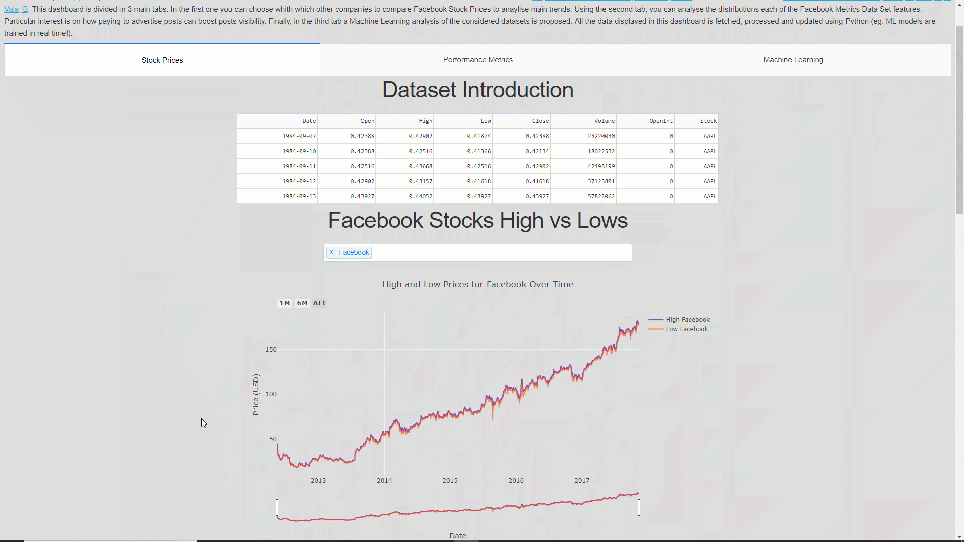
In order to create the following dashboard, I made use of two different datasets. The first one is the Huge Stock Market Dataset by Boris Marjanovic and the second one is the Facebook metrics Data Set by Moro, S., Rita, P., & Vala, B.
Before loading the first dataset on the dashboard application, I performed some pre-processing analysis, the resulting dataset is available here.
In this demonstration, we will create together a Dashboard composed of two tabs. The first tab will show the High, Low and Volume Stock market indicators of companies such as Facebook, Apple, Microsoft and Tesla. The second tab will instead show the distributions of each of the features available in the Facebook Performance Metrics dataset (Figure 3).
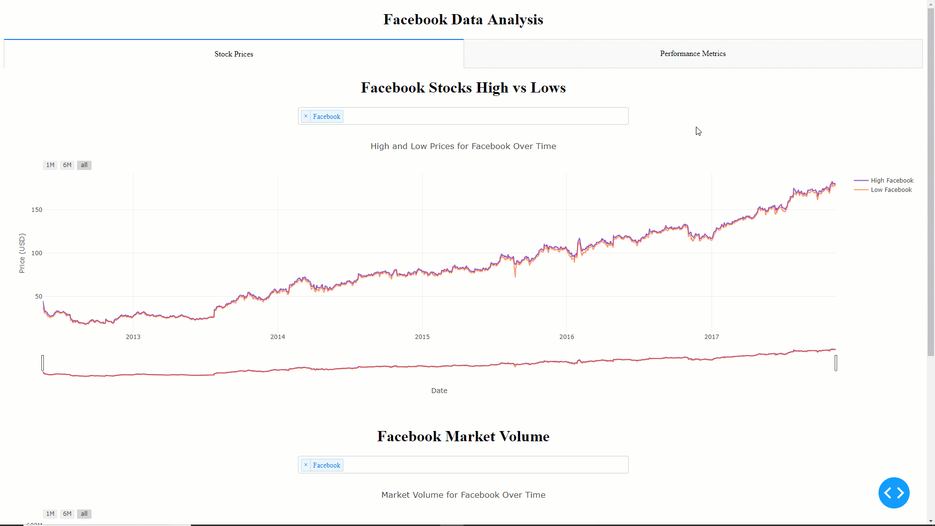
Figure 3: Final Dashboard which we will create in this tutorial
If you are interested in adding more features to this App, on my GitHub repository is available a more advanced version.
Demonstration
First of all, we need to create a Python file called app.py and import all the required dependencies. In this file, we will write all the code necessary to launch our Dashboard.
The datasets we are going to work with will have a structure like shown in Figure 4 and 5.

Figure 4: Stock Dataset
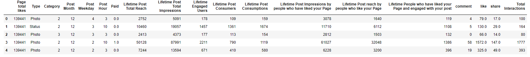
Figure 5: Performance Metrics Dataset
We can then set-up our App and its layout using the code shown below. The layout is stored in app.layout, and all the desired HTML components such as Div, H1, H2, P, etc have been added using the dash_html_components (html) library. Finally, we can add interactive components to our dashboard (eg. tabs, dropdowns, radio buttons) using the dash_core_components (dcc) library.
In this case, I decided to divide this Dashboard into two tabs. In the first one, will be analysed the Stock Prices dataset and in the second one the Performance Metrics dataset. The layout of the first tab is subsequently divided into other two parts each of them formed by an H1 title, a dropdown menu with four different options and a time-series graph. The second tab is instead formed by just an H1 title, a dropdown menu with 18 different options and a histogram.
Once defined the layout of our Dashboard, we can then go on and design the graphs and their interaction with the dropdown menus. The graphs can be designed creating functions and instead the interactions between the graphs and the dropdown menus can be designed using callbacks.
The code below can be divided in 3 main sections: a High-Low Stock Prices Time Series graph, a Market Volume Time Series graph and a Performance Metrics Feature Distributions graph.
The first two sections are really similar, in fact, they are designed to create the same type of graph. The only difference is that in the second graph just one feature is considered instead of two.
In each of the 3 sections, the callbacks (@app.callback) are used to take the selected values from the dropdowns, send them as input to the graph function and then take the variable returned by the function to pass it to the graph declared in the layout. These callbacks will automatically get called every-time the values in the dropdowns changes. The callbacks can automatically identify which of the different dropdowns available on the Dashboard changed value and which graph to subsequently update thanks to the unique id values set before in the Dashboard Layout.
Each of the three functions shown below use Plotly syntax to create the graphs. If you have never used Plotly before, in one of my previous articles I have already talked about Interactive Data Visualization.
The fist function will generate the graph shown below.
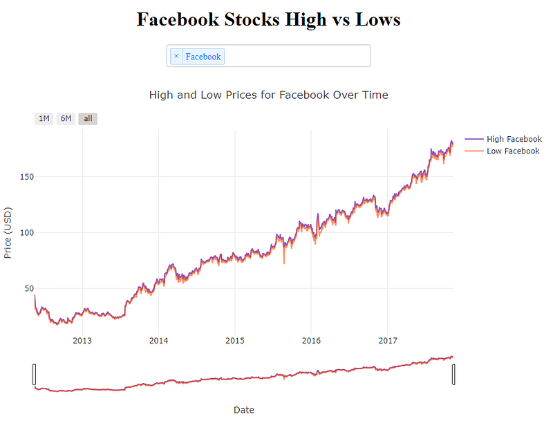
Figure 6: Facebook Stocks, High vs Lows
The second one will instead create the graph shown in Figure 7.
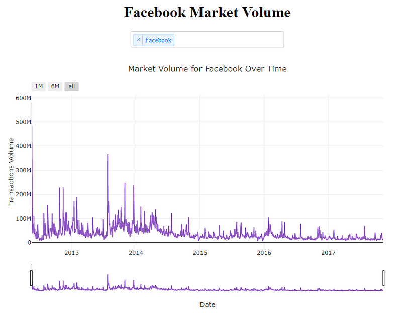
Figure 7: Facebook Market Volume
Lastly, the third function will generate the feature distribution histogram on the second tab of the Dashboard (Figure 8).
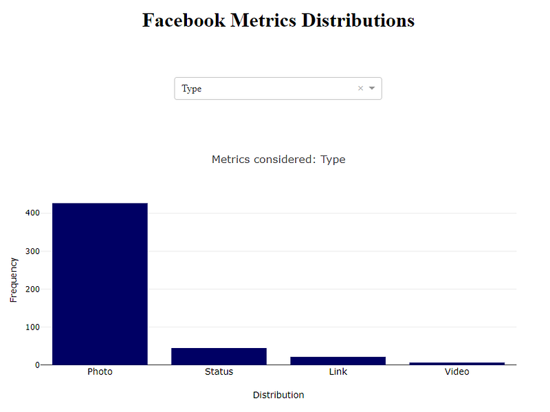
Figure 8: Facebook Metrics Distribution
Finally, we can start a local server and make our application run by using the following two lines of code.
Now that our app is ready, we can simply lunch it by opening our computer terminal in our current working directory and typing python app.py. This will start a web server at http://127.0.0.1:8050/, going at this link we will see our final Python App running.
It is possible to easily deploy online Dash Apps for free hosting our application on Heroku. If you are interested in doing so, I wrote another article about Flask and Heroku for online Machine Learning deployment. Additionally, also the Dash documentation provides guidance on how to deploy Dash Apps on Heroku.
Conclusion
This Dashboard can be further developed by adding additional features such as:
- Use a web-scraping mechanism to fetch new Stock Market data in real-time to update all the related graphs.
- Add more Data Visualisation charts.
- Create Machine Learning models to make predictions (eg. ARIMA, LSTM).
- Improve the Dashboard overall design.
A more advanced version of this dashboard is available to be tested online at this link.
If you need any help to add any of these additional features, the Dash documentation is a great place where to start.
I hope you enjoyed this article, thank you for reading!
Bibliography
[1] Dash operationalizes Python & R models at scale, Plotly. Accessed at: https://plot.ly/dash
Contacts
If you want to keep updated with my latest articles and projects follow me on Medium and subscribe to my mailing list. These are some of my contacts details:
