Contents
Machine Learning Visualization
A collection of a few interesting techniques which can be used in order to visualise different aspects of the Machine Learning pipeline.
Introduction
As part of any Data Science project, Data Visualization plays an important part in order to learn more about the available data and to identify any main pattern.
Wouldn’t be great if it could be possible to make as visually intuitive as possible also the Machine Learning part of the analysis?
In this article, we are going to explore some techniques which could help us to face this challenge such as: Parallel Coordinates Plots, Summary Data Tables, drawing ANNs graphs and many more.
All the code used in this article is freely available on my Github and Kaggle Accounts.
Techniques
Hyperparameters Optimization
Hyperparameter Optimization is one of the most common activities in Machine/Deep Learning. Machine Learning models tuning is a type of optimization problem. We have a set of hyperparameters (eg. learning rate, number of hidden units, etc…) and we aim to find out the right combination of their values which can help us to find either the minimum (eg. loss) or the maximum (eg. accuracy) of a function.
In one of my previous articles, I went into the details of how what kind of techniques we can use in this ambit and how to test them in a 3D space, in this article I will instead show you how we can accomplish that for reporting in a 2D space.
One of the best solutions for this type of task is to use a parallel coordinates plot (Figure 1). Using this type of plot, we can in fact easily compare different variables (eg. features) together in order to discover possible relationships. In the case of Hyperparameters Optimization, this can be used as a simple tool to inspect what combination of parameters can give us the greatest test accuracy. Another possible use of parallel coordinates plots in Data Analysis is to inspect relationships in values between the different features in a data frame.
In Figure 1, is available a practical example created using Plotly.
import plotly.express as px

fig = px.parallel_coordinates(df2, color="mean_test_score",
          labels=dict(zip(list(df2.columns),
          list(['_'.join(i.split('_')[1:]) for i **in **df2.columns]))),
          color_continuous_scale=px.colors.diverging.Tealrose,
          color_continuous_midpoint=27)

fig.show()
Figure 1: Parallel Coordinates Hyperparameter Optimization Plot.
Different techniques can be used in order to create Parallel Coordinates plots in Python such as using Pandas, Yellowbrick, Matplotlib or Plotly. Step by step examples using all these different methods are available in this my notebook at this link.
Finally, another possible solution which can be used in order to create this type of plot is by using Weights & Biases Sweeps functionality. Weights & Biases is a free tool which can be used in order to automatically create plots and logs of different machine learning tasks (eg. learning curves, graphing models, etc…) for either individuals or teams.
Data Wrapper
Data Wrapper is a free online tool designed for professional charts creation. This tool is for example used in articles by journals such as The New York Times, Vox and WIRED. No sign-in is required and all the process can be completely done online.
This year has been additionally created a Python wrapper for this tool. This can be easily installed using:
pip install datawrapper
In order to use the Python API, we additionally need to sign-up for Data Wrapper, go to the settings and create an API Key. Using this API Key, we would then be able to use remotely Data Wrapper.
At this point, we can easily create a Bar Plot for example, by using the following few lines of code and passing a Pandas data frame as an input of our create_chart function.
from datawrapper import Datawrapper
dw = Datawrapper(access_token = "TODO")

games_chart = dw.create_chart(title = "Most Frequent Game Publishers",
                            chart_type = 'd3-bars', data = df)

dw.update_description(
     games_chart['id'],
     source_name = 'Video Game Sales',
     source_url = 'https://www.kaggle.com/gregorut/videogamesales',
     byline = 'Pier Paolo Ippolito',
)

dw.publish_chart(games_chart['id'])
The resulting graph is available in the figure below.
Figure 2: Data Wrapper Bar Chart
Once published our chart, we can then find it in the list of created charts on our Data Wrapper Account. Clicking on our chart, we will then find a list of different options which we can use in order to easily share our graph (eg. Embed, HTML, PNG, etc…). A full list of all the different types of supported charts is available at this link.
Plotly Prediction Table
When working with time-series data, it can be really handy at times to be able to quickly understand on which datapoints our model is performing poorly, in order to try to understand what limitations it might be facing.
One possible approach is to create a summary table with the actual and predicted values and some form of metrics summarising how well/bad a data point has been predicted.
Using Plotly, this can be easily done by creating a plotting function:
import chart_studio.plotly as py
import plotly.graph_objs as go
from plotly.offline import init_notebook_mode, iplot
init_notebook_mode(connected=True)
import plotly

def predreport(y_pred, Y_Test):
    diff = y_pred.flatten() - Y_Test.flatten()
    perc = (abs(diff)/y_pred.flatten())*100
    priority = []
    for i in perc:
        if i > 0.4:
            priority.append(3)
        elif i> 0.1:
            priority.append(2)
        else:
            priority.append(1)

    print("Error Importance 1 reported in ", priority.count(1),
          "cases\n")
    print("Error Importance 2 reported in", priority.count(2),
          "cases\n")
    print("Error Importance 3 reported in ", priority.count(3),
          "cases\n")
    colors = ['rgb(102, 153, 255)','rgb(0, 255, 0)',
              'rgb(255, 153, 51)', 'rgb(255, 51, 0)']

    fig = go.Figure(data=[go.Table(header=
                    dict(
                        values=['Actual Values', 'Predictions',
                        '% Difference', "Error Importance"],
                        line_color=[np.array(colors)[0]],
                        fill_color=[np.array(colors)[0]],
                                    align='left'),
                    cells=dict(
                       values=[y_pred.flatten(),Y_Test.flatten(),
                               perc, priority],
                       line_color=[np.array(colors)[priority]],
                       fill_color=[np.array(colors)[priority]],
                                    align='left'))])

    init_notebook_mode(connected=False)
    py.plot(fig, filename = 'Predictions_Table', auto_open=True)
    fig.show()
Calling this function would then result in the following output (feel free to test the table in Figure 3!):
Error Importance 1 reported in  34 cases

Error Importance 2 reported in  13 cases

Error Importance 3 reported in  53 cases
Figure 3: Prediction Table
Decision Trees
Decision Trees are one of the most easily explainable types of Machine Learning model. Thanks to their basilar structure, it is easily possible to examine how the algorithm decides to make its decision by looking at the conditions on the different branches of the tree. Additionally, Decision Trees can also be used as a Feature Selection technique, considering that the algorithm puts at the top levels of the tree the features which think are most valuable for our desired classification/regression task. In this way, the features at the bottom of the tree could be discarded since carrying less information.
One of the easiest ways to visualise a classification/regression decision tree is to use export_graphviz from sklearn.tree. In this article, a different and more complete approach is provided using the dtreeviz library.
Using this library, a Classification Decision Tree can be created by just using the following few lines of code:
import dtreeviz as dtv

viz = dtv.model(clf,
            X_train,
            y_train.values,
            target_name='Genre',
            feature_names=list(X.columns),
            class_names=list(labels.unique()))

viz.view()
The resulting plot is available in Figure 4.
Figure 4: Classification Decision Tree
In Figure 4, the different classes are represented by a different colour. The feature distributions of all the different classes are represented in the tree’s starting node. As long as we move down each branch the algorithm tries then to best separate the different distributions using the feature described underneath each of the node graphs. The circles generated alongside the distributions represent the number of elements correctly classified after following a certain node, the bigger the number of elements the bigger the size of the circle.
An example using a Decision Tree Regressor is instead shown in Figure 5.
Figure 5: Decision Tree Regressor
Decision Boundaries
Decision Boundaries are one of the easiest approaches to graphically understand how a Machine Learning model is making its predictions. One of the easiest ways to plot decision boundaries in Python is to use Mlxtend. This library, can in fact be used for plotting decision boundaries of either Machine Learning and Deep Learning models. A simple example is shown in Figure 6.
from mlxtend.plotting import plot_decision_regions
import matplotlib.pyplot as plt
import matplotlib.gridspec as gridspec
import itertools

gs = gridspec.GridSpec(2, 2)

fig = plt.figure(figsize=(10,8))

clf1 = LogisticRegression(random_state=1,
                          solver='newton-cg',
                          multi_class='multinomial')
clf2 = RandomForestClassifier(random_state=1, n_estimators=100)
clf3 = GaussianNB()
clf4 = SVC(gamma='auto')

labels = ['Logistic Regression','Random Forest','Naive Bayes','SVM']
for clf, lab, grd in zip([clf1, clf2, clf3, clf4],
                         labels,
                         itertools.product([0, 1], repeat=2)):

    clf.fit(X_Train, Y_Train)
    ax = plt.subplot(gs[grd[0], grd[1]])
    fig = plot_decision_regions(X_Train, Y_Train, clf=clf, legend=2)
    plt.title(lab)

plt.show()
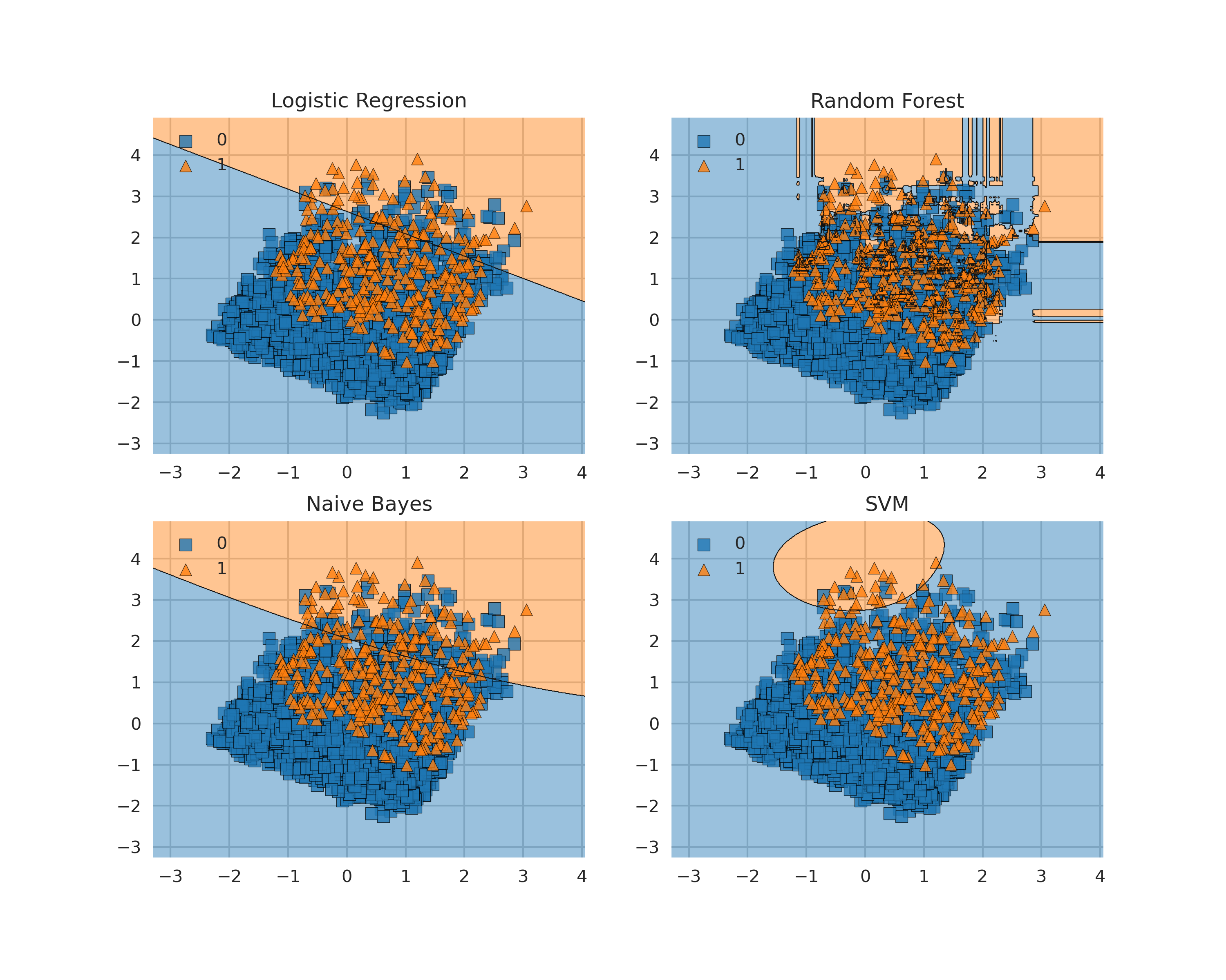 Figure 6: Plotting Decision Boundaries
Some possible alternatives to Mlxtend are: Yellowbrick, Plotly or a plain Sklearn and Numpy implementation. Step by step examples using all these different methods are available in this my notebook at this link.
Additionally, different animated versions of decision boundaries converging during training are available on my website at this link.
One of the main limitations of plotting decision boundaries is that they can only be easily visualised in two or three dimensions. Due to these limitations, it might be therefore necessary most of the times to reduce the dimensionality of our input features (using some form of feature extraction techniques) before plotting the decision boundary.
Artificial Neural Networks
Another technique which can be quite useful when creating new neural network architectures is visualising their structure. This can be easily done using ANN Visualiser (Figure 7).
from keras.models import Sequential
from keras.layers import Dense
from ann_visualizer.visualize import ann_viz

model = Sequential()
model.add(Dense(units=4,activation='relu',
                  input_dim=7))
model.add(Dense(units=4,activation='sigmoid'))
model.add(Dense(units=2,activation='relu'))

ann_viz(model, view=True, filename="example", title="Example ANN")
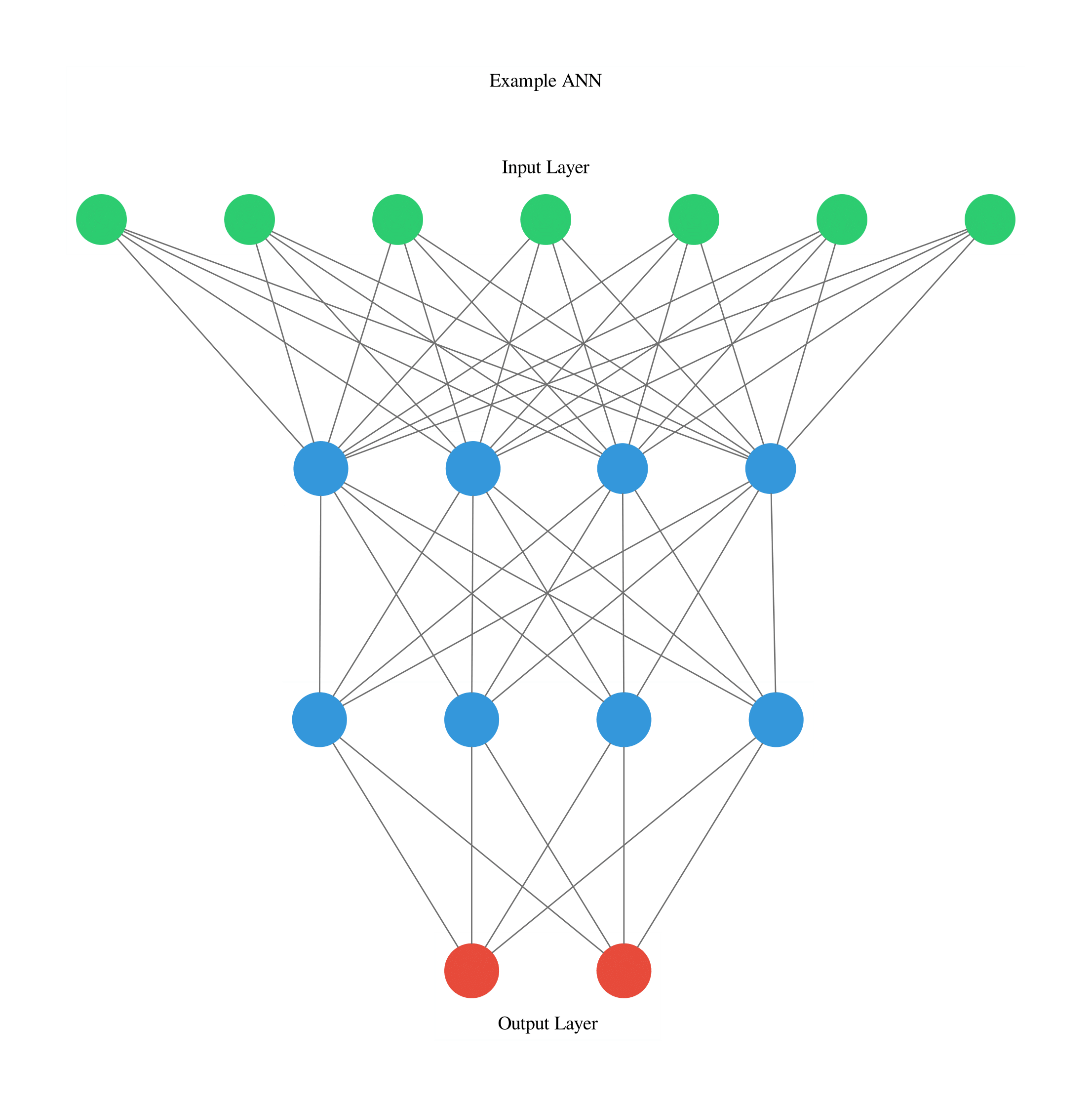
Figure 7: ANN Graph
Livelossplot
Automatically being able to plot on live a neural network loss and accuracy during training and validation can be of great help in order to immediately see if the network is making any progress over time. This can be easily done by using Livelossplot.
In Figure 8, is available an example of loss plot created in real-time in Pytorch while training a Variational Autoencoder (VAE).
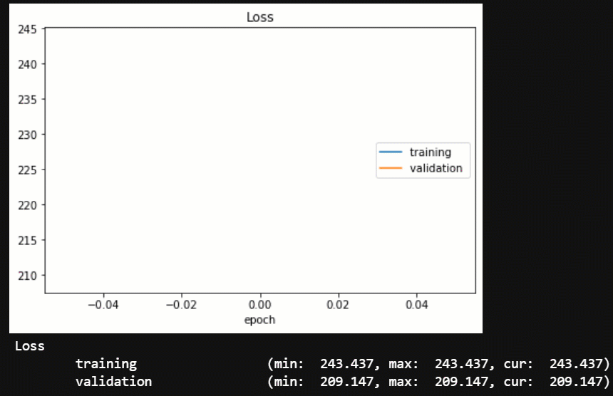 Figure 8: Live VAE training
Using Livelossplot, this can be easily done by storing all the metrics we want to record in a dictionary and update the plot at the end of each iteration. This same procedure can then be applied if we are interested in creating multiple graphs (eg. one for the loss and one with the overall accuracy).
from livelossplot import PlotLosses

liveloss = PlotLosses()

for epoch in range(epochs):
    logs = {}
    for phase in ['train', 'val']:
        losses = []

        if phase == 'train':
            model.train()
        else:
            model.eval()

        for i, (inp, _) in enumerate(dataloaders[phase]):
            out, z_mu, z_var = model(inp)
            rec=F.binary_cross_entropy(out,inp,reduction='sum')/
                                       inp.shape[0]
            kl=-0.5*torch.mean(1+z_var-z_mu.pow(2)-torch.exp(z_mu))
            loss = rec + kl
            losses.append(loss.item())

            if phase == 'train':
                optimizer.zero_grad()
                loss.backward()
                optimizer.step()

        prefix = ''
        if phase == 'val':
            prefix = 'val_'

        logs[prefix + 'loss'] = np.mean(losses)

    liveloss.update(logs)
    liveloss.send()
Livelossplot can additionally be used with other libraries such as Keras, Pytorch-Lightin, Bokeh, etc…
Variational Autoencoders
Variational Autoencoders (VAE) are a type of probabilistic generative model used in order to create a latent representation of some input data (eg. images) able to concisely understand the original data and generate brand new data from it (eg. training a VAE model with different images of car designs, could then enable to model to create brand new imaginative car designs).
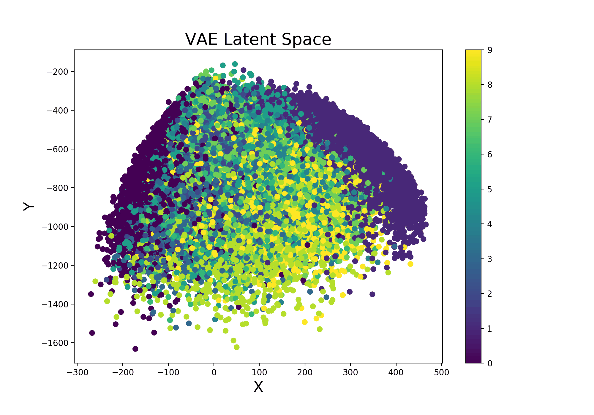
Continuing from the example Variational Autoencoder trained using Livelossplot, we can even make our model more interesting by examining how the latent space (Figure 9) varies from one iteration to another (and therefore how much our model improved to distinguish the different classes over time).
This can be easily done by adding the following function in the previous training loop:
def latent_space(model, train_set, it=''):
    x_latent = model.enc(train_set.data.float())
    plt.figure(figsize=(10, 7))
    plt.scatter(x_latent[0][:,0].detach().numpy(),
                x_latent[1][:,1].detach().numpy(),
                c=train_set.targets)
    plt.colorbar()
    plt.title("VAE Latent Space", fontsize=20)
    plt.xlabel("X", fontsize=18)
    plt.ylabel("Y", fontsize=18)
    plt.savefig('VAE_space'+str(it)+'.png', format='png', dpi=200)
    plt.show()
Figure 9: VAE Latent Space Evolution
Finally, a similar procedure can be applied in order to visualise live also how our VAE improves from iteration to iteration in generating realistic images (Figure 10).
def manifold(model, it='', n=18, size=28):
    result = torch.zeros((size * n, size * n))

    # Defyining grid space
    s, s2 = torch.linspace(-7, 7, n), torch.linspace(7, -7, n)
    grid_x, grid_y = torch.std(s)*s, torch.std(s2)*s2

    for i, y_ex in enumerate(grid_x):
        for j, x_ex in enumerate(grid_y):
            z_sample = torch.repeat_interleave(torch.tensor([
                       [x_ex, y_ex]]),repeats=batch_size, dim=0)
            x_dec = model.dec(z_sample)
            element = x_dec[0].reshape(size, size).detach()
            result[i * size: (i + 1) * size,
                   j * size: (j + 1) * size] = element

    plt.figure(figsize=(12, 12))
    plt.title("VAE Samples", fontsize=20)
    plt.xlabel("X", fontsize=18)
    plt.ylabel("Y", fontsize=18)
    plt.imshow(result, cmap='Greys')
    plt.savefig('VAE'+str(it)+'.png', format='png', dpi=300)
    plt.show()
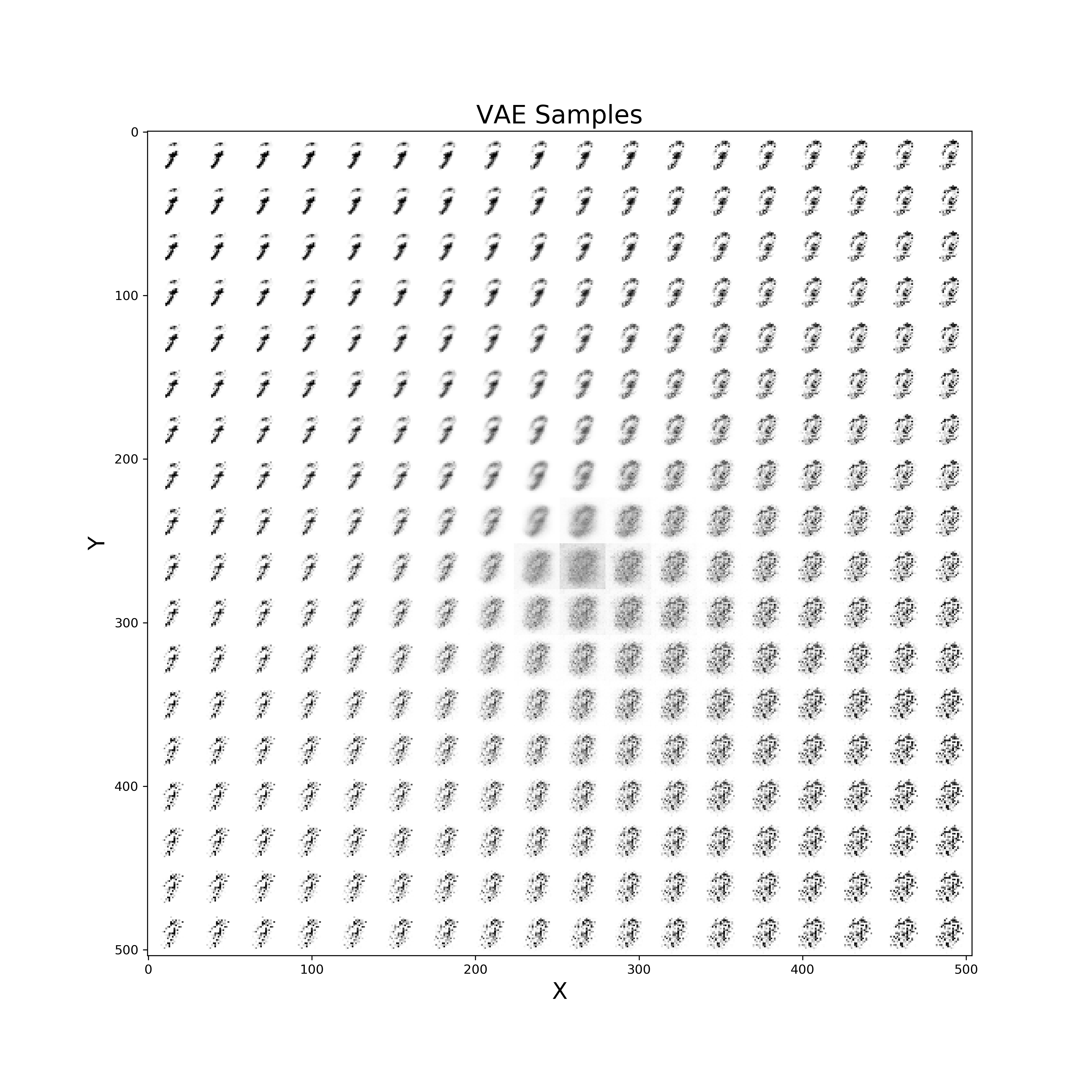 Figure 10: VAE improvement over time to create new digits
A practical demonstration of a Variational Autoencoder deployed online using ONNX in order to make inference on the fly, is available at this link on my personal website.
Word Embeddings
Neural Network Embeddings are a class of neural networks designed in order to learn how to convert some form of categorical data into numerical data. Using Embeddings can be considerably advantageous than using other techniques such as One Hot Encoding considering that, while converting the data, they are able to learn about its characteristics and therefore construct a more succinct representation (creating a latent space). Two of the most famous types of pre-trained word embeddings are word2vec and Glove.
As a simple example, we are now going to plot an embed space representing different books authors. First of all, we need to create an train a model on some available data and then access the trained weights of the model embedded layer (in this case called embed) and store them in a data frame. Once this process is done, we then just have to plot the three different coordinates (Figure 11).
import matplotlib.pyplot as plt
from mpl_toolkits.mplot3d import axes3d, Axes3D

embedding_weights=pd.DataFrame(model.embed.weight.detach().numpy())
embedding_weights.columns = ['X1','X2','X3']

fig = plt.figure(num=None, figsize=(14, 12), dpi=80,
                 facecolor='w', edgecolor='k')
ax = plt.axes(projection='3d')
for index, (x, y, z) in enumerate(zip(embedding_weights['X1'],
                                      embedding_weights['X2'],
                                      embedding_weights['X3'])):
    ax.scatter(x, y, z, color='b', s=12)
    ax.text(x, y, z, str(df.authors[index]), size=12,
            zorder=2.5, color='k')

ax.set_title("Word Embedding", fontsize=20)
ax.set_xlabel("X1", fontsize=20)
ax.set_ylabel("X2", fontsize=20)
ax.set_zlabel("X3", fontsize=20)
plt.show()
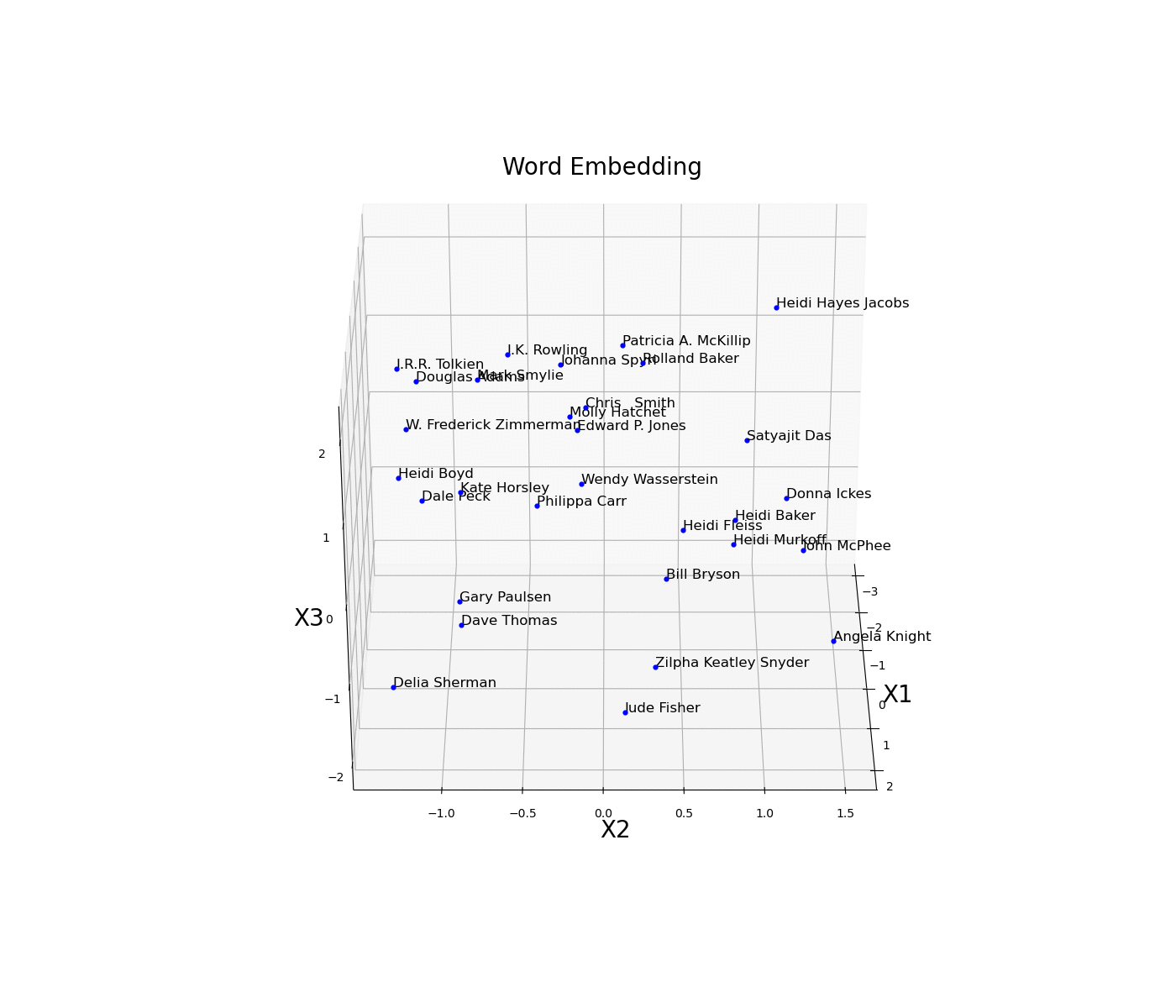 Figure 11: Word Embedding
In this example, the embedding dimensions of the network have been set directly to 3 in order to then easily create the 3D visualization. Another possible solution could have been to instead use a higher embedding output size and then apply some form of feature extraction technique (eg. t-SNE, PCA, etc…) in order to visualise the results.
Another interesting technique which can be used to visualise categorical data is Wordclouds (Figure 12). This type of representation, can, for example, be realised by creating a dictionary of book authors names and their respective frequency count in the dataset. Authors which appears more frequently in the dataset will be then represented in the figure with greater font size.
from wordcloud import WordCloud

d = {}
for x, a in zip(df.authors.value_counts(),
                df.authors.value_counts().index):
    d[a] = x

wordcloud = WordCloud()
wordcloud.generate_from_frequencies(frequencies=d)
plt.figure(num=None, figsize=(12, 10), dpi=80, facecolor='w',
           edgecolor='k')
plt.imshow(wordcloud, interpolation="bilinear")
plt.axis("off")
plt.title("Word Cloud", fontsize=20)
plt.show()
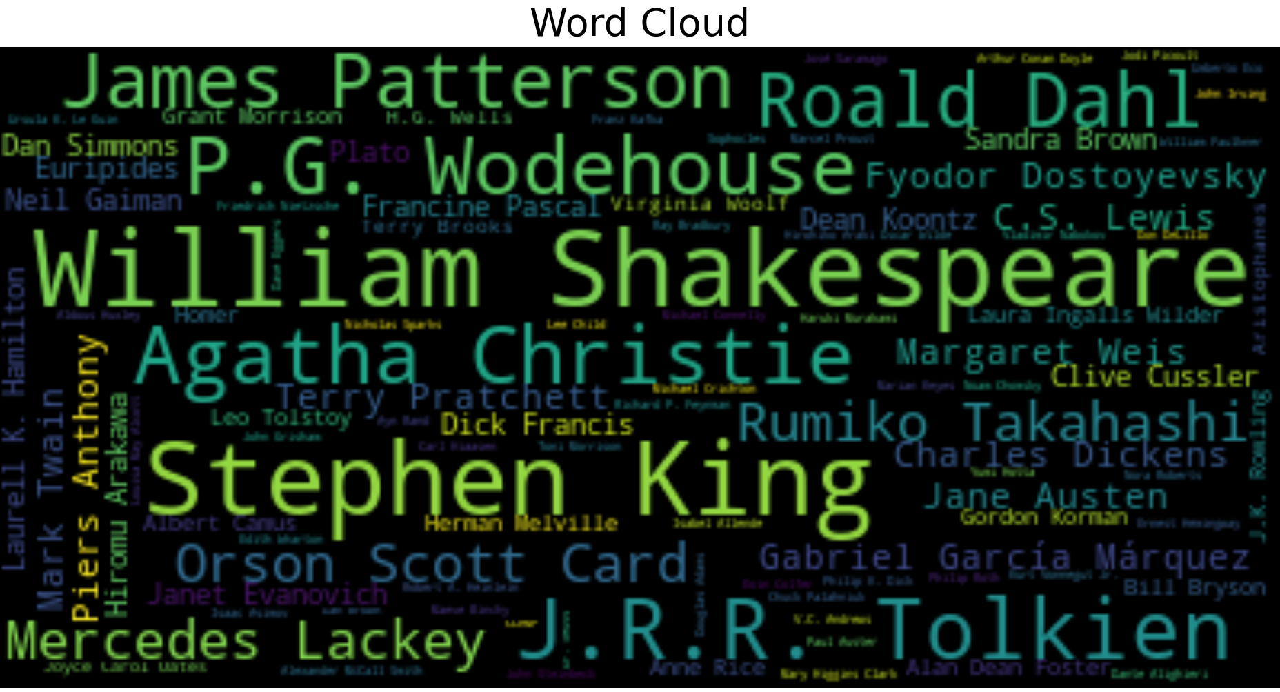 Figure 12: Wordcloud Example
As always, the complete code is available on my Github account.
Explainable AI
Explainable AI is nowadays a growing field of research. Use of AI in decision-making applications (such as employment) has recently caused some concerns both for individuals and authorities. This is because, when working with deep neural networks, it is currently not possible (at least to a full extent) to understand the decision-making process the algorithm performs when having to carry out a predetermined task. Because of this lack of transparency in the decision-making process, perplexities can arise from the public regarding the trustworthiness of the model itself. Therefore, the need for Explainable AI is now becoming the next prefixed evolutionary step in order to prevent the presence of any form of bias in AI models.
During the last few years, different visualization techniques have been introduced in order to make Machine Learning more explainable such as:
Exploring Convolutional Neural Networks Filters and Feature maps.
Graphs Networks.
Bayesian-based models.
Causal Reasoning applied to Machine Learning.
Local/Global surrogate models.
Introduction of Local Interpretable Model-Agnostic Explanations (LIME) and Shapley Values.
If you are interested in finding out more about how to make Machine Learning models more explainable, two of the most interesting libraries currently available in Python in order to apply Explainable AI in Deep Learning are Captum by Pytorch and XAI.
As this research area is in constant improvement, I will aim to cover all these different topics (and more) in a future article dedicated to just Explainable AI.
Conclusion
In case you are interested in finding out more Machine Learning Visualization techniques, the Python Yellowbrick library has a high focus on this topic. Some examples of visualizer provided are: features ranking, ROC/AUC curves, K-Elbow plots and various Text Visualization techniques.
Finally, over the last few years, different frameworks have started being developed in order to make Machine Learning visualization easier such as: TensorBoard, Weights & Biases and Neptune.ai.
I hope you enjoyed this article, thank you for reading!
Contacts
If you want to keep updated with my latest articles and projects follow me on Medium and subscribe to my mailing list. These are some of my contacts details:
