Contents

Stock Market Analysis Using ARIMA
The four most dangerous words in investing are: “This time it’s different”, Sir John Templeton
Time Series Data
Time Series is a big component of our everyday lives. They are in fact used in medicine (EEG analysis), finance (Stock Prices) and electronics (Sensor Data Analysis). Many Machine Learning models have been created in order to tackle these types of tasks, two examples are ARIMA (AutoRegressive Integrated Moving Average) models and RNNs (Recurrent Neural Networks).
Introduction
I have been recently working on a Stock Market Dataset on Kaggle. This dataset provides all US-based stocks daily price and volume data. If you want to find out more about it, all my code is freely available on my Kaggle and GitHub profiles.
In this post, I will explain how to address Time Series Prediction using ARIMA and what results I obtained using this method when predicting Microsoft Corporation stock prices.
ARIMA (AutoRegressive Integrated Moving Average)
The acronym of ARIMA stands for [1]:
- AutoRegressive = the model takes advantage of the connection between a predefined number of lagged observations and the current one.
- Integrated = differencing between raw observations (eg. subtracting observations at different time steps).
- Moving Average = the model takes advantage of the relationship between the residual error and the observations.
The ARIMA model makes use of three main parameters (p,d,q). These are:
- p = number of lag observations.
- d = the degree of differencing.
- q = the size of the moving average window.
ARIMA can lead to particularly good results if applied to short time predictions (like has been used in this example). Different code models of ARIMA in Python are available here.
Analysis
In order to realise the following code exercise, I made use of the following libraries and dependencies.
import numpy as np
import pandas as pd
import matplotlib.pyplot as plt
from pandas.plotting import lag_plot
from pandas import datetime
from statsmodels.tsa.arima_model import ARIMA
from sklearn.metrics import mean_squared_error
First of all, I loaded the specific Microsoft (MSFT) dataset among all the other available. This dataset is composed of seven different features (Figure 1). In this post, I will just examine the “Open” stock prices feature. This same analysis can be repeated for most of the other features.
df = pd.read_csv("../input/Data/Stocks/msft.us.txt").fillna(0)
df.head()
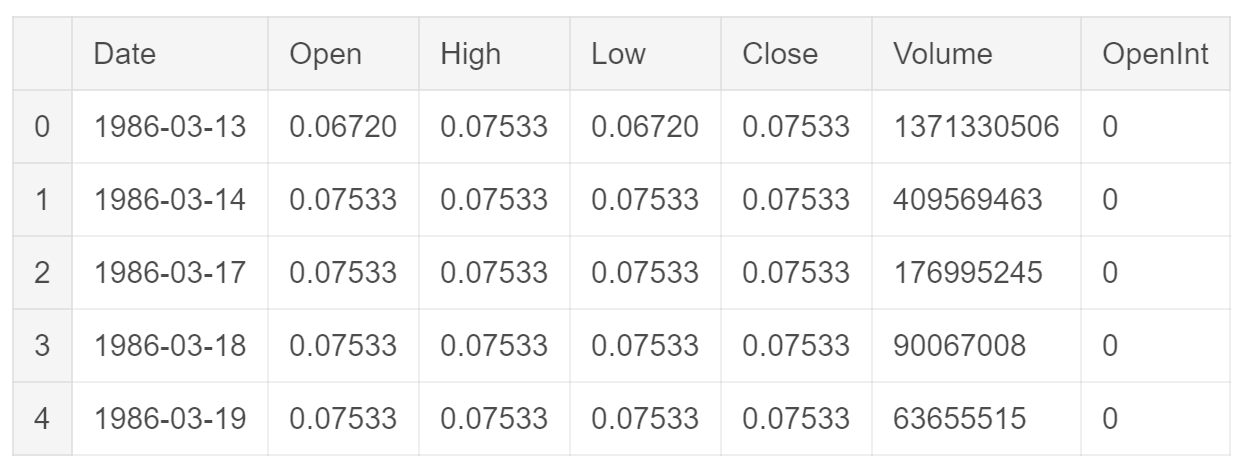
Figure 1: Dataset Head
Before starting working on Time Series prediction, I decided to analyse the autocorrelation plot of the “Open” feature (Figure 2) with respect to a fixed lag of 5. The results shown in Figure 2 confirmed the ARIMA would have been a good model to be applied to this type of data.
plt.figure(figsize=(10,10))
lag_plot(df['Open'], lag=5)
plt.title('Microsoft Autocorrelation plot')
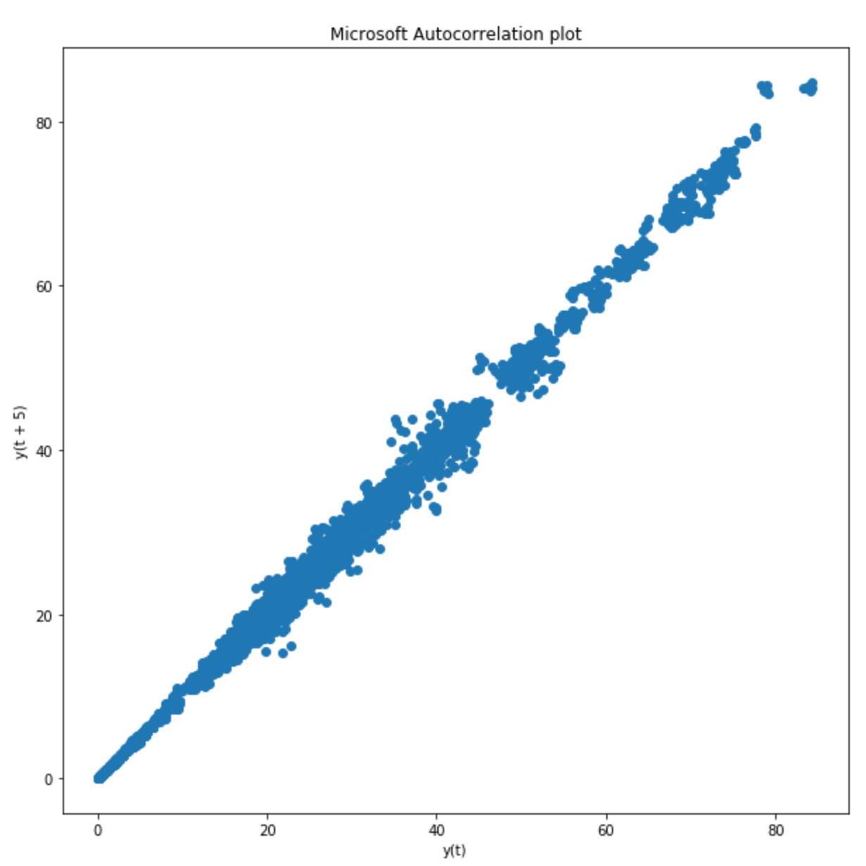
Figure 2: Autocorrelation plot using a Lag of 5
Successively, I divided the data into a training and test set. Once done so, I plotted both on the same figure in order to get a feeling of how does our Time Series looks like (Figure 3).
train_data, test_data = df[0:int(len(df)*0.8)], df[int(len(df)*0.8):]
plt.figure(figsize=(12,7))
plt.title('Microsoft Prices')
plt.xlabel('Dates')
plt.ylabel('Prices')
plt.plot(df['Open'], 'blue', label='Training Data')
plt.plot(test_data['Open'], 'green', label='Testing Data')
plt.xticks(np.arange(0,7982, 1300), df['Date'][0:7982:1300])
plt.legend()
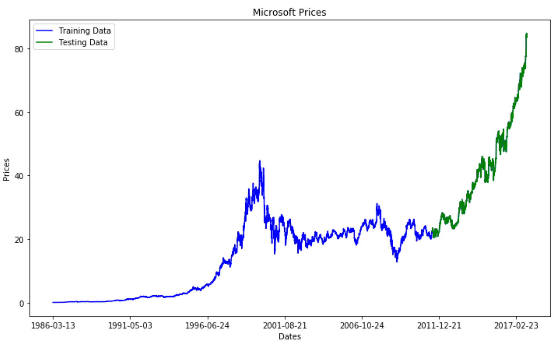
Figure 3: Graphical Representation of Train/Test Split
In order to evaluate the ARIMA model, I decided to use two different error functions: Mean Squared Error (MSE) and Symmetric Mean Absolute Percentage Error (SMAPE). SMAPE is commonly used as an accuracy measure based on relative errors (Figure 4).
SMAPE is not currently supported in Scikit-learn as a loss function I, therefore, had first to create this function on my own.
def smape_kun(y_true, y_pred):
    return np.mean((np.abs(y_pred - y_true) * 200/ (np.abs(y_pred) + np.abs(y_true))))
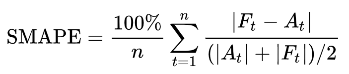
Figure 4: SMAPE (Symmetric mean absolute percentage error) [2]
Afterwards, I created the ARIMA model to be used for this implementation. I decided to set in this case p=5, d=1 and q=0 as the ARIMA parameters.
train_ar = train_data['Open'].values
test_ar = test_data['Open'].values

history = [x for x
    train_ar]
print(type(history))
predictions = list()
for t
    range(len(test_ar)):
    model = ARIMA(history, order=(5,1,0))
    model_fit = model.fit(disp=0)
    output = model_fit.forecast()
    yhat = output[0]
    predictions.append(yhat)
    obs = test_ar[t]
    history.append(obs)
error = mean_squared_error(test_ar, predictions)
print('Testing Mean Squared Error: ' % error)
error2 = smape_kun(test_ar, predictions)
print('Symmetric mean absolute percentage error: ' % error2)
The loss results for this model are available below. According to the MSE, the model loss is quite low but for SMAPE is instead consistently higher. One of the main reason for this discrepancy is because SMAPE is commonly used loss a loss function for Time Series problems and can, therefore, provide a more reliable analysis. That showed there is still room for improvement of our model.
Testing Mean Squared Error: 0.343
Symmetric mean absolute percentage error: 40.776
Finally, I decided to plot the training, test and predicted prices against time to visualize how did the model performed against the actual prices (Figure 5).
plt.figure(figsize=(12,7))
plt.plot(df['Open'], 'green', color='blue', label='Training Data')
plt.plot(test_data.index, predictions, color='green', marker='o',
        linestyle='dashed', label='Predicted Price')
plt.plot(test_data.index, test_data['Open'], color='red',
        label='Actual Price')
plt.title('Microsoft Prices Prediction')
plt.xlabel('Dates')
plt.ylabel('Prices')
plt.xticks(np.arange(0,7982, 1300), df['Date'][0:7982:1300])
plt.legend()
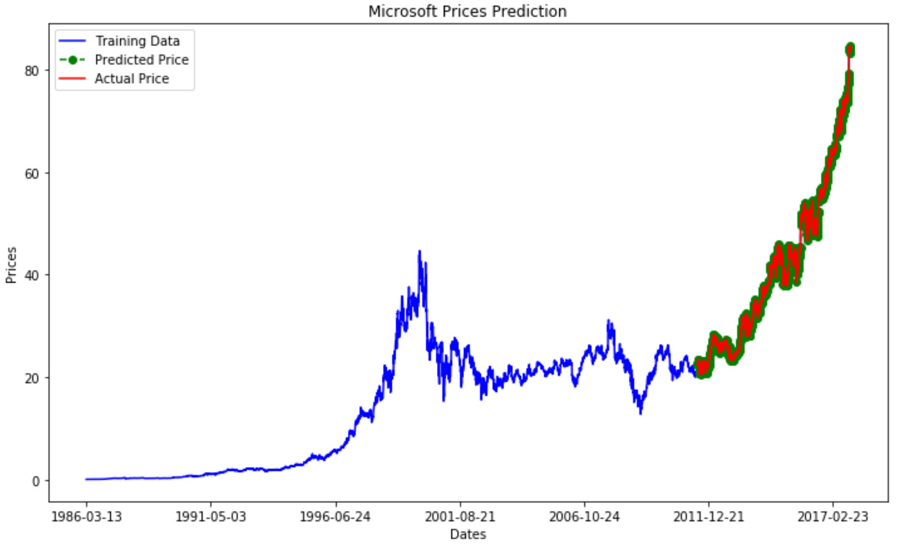
Figure 5: Microsoft Price Prediction
Figure 6 provides instead a zoomed in version of Figure 5. From this can be noticed how the two curves closely follow each other. However, the predicted price seems to look like a “noisy” version of the actual price.
plt.figure(figsize=(12,7))
plt.plot(test_data.index, predictions, color='green', marker='o',
        linestyle='dashed',label='Predicted Price')
plt.plot(test_data.index, test_data['Open'], color='red',
        label='Actual Price')
plt.legend()
plt.title('Microsoft Prices Prediction')
plt.xlabel('Dates')
plt.ylabel('Prices')
plt.xticks(np.arange(6386,7982, 300), df['Date'][6386:7982:300])
plt.legend()
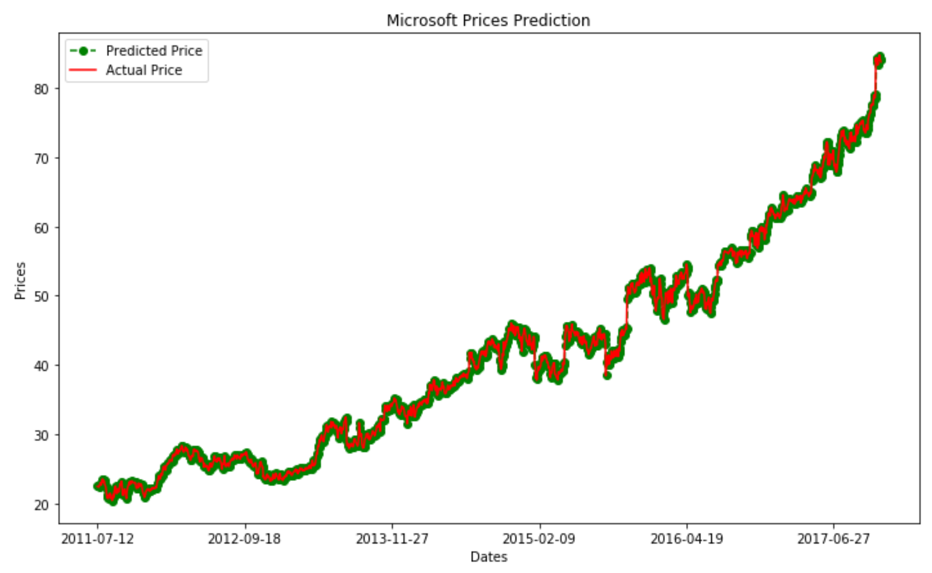
Figure 6: Prediction vs Actual Price Comparison
This analysis using ARIMA lead overall to appreciable results. This model demonstrated in fact to offer good prediction accuracy and to be relatively fast compared to other alternatives such as RRNs (Recurrent Neural Networks).
Bibliography
[1] How to Create an ARIMA Model for Time Series Forecasting in Python, Jason Brownlee, Machine Learning Mastery. Accessed at: https://machinelearningmastery.com/arima-for-time-series-forecasting-with-python/
[2] Symmetric mean absolute percentage error, Wikipedia. Accessed at: https://en.wikipedia.org/wiki/Symmetric_mean_absolute_percentage_error
Contacts
If you want to keep updated with my latest articles and projects follow me on Medium and subscribe to my mailing list. These are some of my contacts details:
