Contents
 on [Unsplash](https://unsplash.com?utm_source=medium&utm_medium=referral)](https://cdn-images-1.medium.com/max/9692/0*XZEB5gkAssN-0RoD)
Python on the Web
Showcasing Python applications on the web without any server
Introduction
Using popular Python visualization libraries it can be relatively straightforward to create locally charts and dashboards of different forms. Although, it can be much more complicated to share your results with other people on the web.
One possible approach to do this is using libraries such as Streamlit, Flask, Plotly Dash and paying for a web hosting service to cover the server side and run your Python scripts to show on the webpage. Alternatively, some providers like Plotly Chart or Datapane provide also free cloud support for you to upload your Python visualizations and then embed them on the web. In both scenarios, you would be able to achieve anything you need if you have a small budget for your project, but there is any way we could achieve similar results for free?
As part of this article, we are going to explore 3 possible approaches:
In order to showcase each of these 3 approaches, we are going to create a simple application to explore historical inflation data from all over the world. In order to do so, we are going to use The World Bank Gloabal Database of Inflation all information about licensing for the data can be found at this link [1].
Once downloaded the data, we can then use the following pre-processing function in order to better shape the dataset for visualization and import just the 3 Excel Sheets we are going to use as part of the analysis (overall inflation data, inflation for food and energy prices).
import pandas as pd

def import_data(name):
    df = pd.read_excel("Inflation-data.xlsx", sheet_name=name)
    df = df.drop(["Country Code", "IMF Country Code", "Indicator Type", "Series Name", "Unnamed: 58"], axis=1)
    df = (df.melt(id_vars = ['Country', 'Note'],
                var_name = 'Date', value_name = 'Inflation'))
    df = df.pivot_table(index='Date', columns='Country',
                        values='Inflation', aggfunc='sum')
    return df

inf_df = import_data("hcpi_a")
food_df = import_data("fcpi_a")
energy_df = import_data("ecpi_a")
Each dataset will then have a date index with a row for each year and a column for each of the different countries with their respective inflation percentage values (Figure 1).
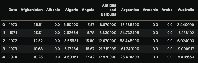
Figure 1: Overall Inflation Dataset (Image by Author).
All the code used as part of this project can be freely accessed on my GitHub profile and the resulting online dashboards from this project can be accessed at this link.
Panel
Panel is an open-source Python library part of the HoloViz ecosystem. It can be simply installed using the following command:
pip install panel
Once imported the data, we can then proceed to develop our application:
- We first import the necessary libraries.
- Specify a template to use to style the application and its title.
- Create a dropdown widget where the user can select a country to examine. In this case Switzerland is provided as the default choice when the application is loaded.
- 3 helper functions are designed in order to take the selected country as input and then return different temporal parts of the series to nicely display the raw inflation data to the user.
- Ultimately, the 3 helper functions are binded with the dropdown widget and added together on a column on the interface.
import pandas as pd
import matplotlib.pyplot as plt
import panel as pn
from holoviews import opts
import hvplot.pandas

pn.config.template = 'fast'
pn.config.template.title="Panel Inflation Monitoring Application"

country_widget = pn.widgets.Select(name="Country", value="Switzerland", options=list(inf_df.columns))

def pivot_series(inf_df, country):
    df = pd.DataFrame({'Date':inf_df[country].index, 'Inflation':[round(i, 3) for i in inf_df[country].values]})
    df = df.pivot_table(values='Inflation', columns='Date')
    return df

def make_df_plot(country):
    df = pivot_series(inf_df, country)
    return pn.pane.DataFrame(df.iloc[:, : 17])

def make_df_plot2(country):
    df = pivot_series(inf_df, country)
    return pn.pane.DataFrame(df.iloc[:, 17:34])

def make_df_plot3(country):
    df = pivot_series(inf_df, country)
    return pn.pane.DataFrame(df.iloc[:, 34:])

bound_plot = pn.bind(make_df_plot, country=country_widget)
bound_plot2 = pn.bind(make_df_plot2, country=country_widget)
bound_plot3 = pn.bind(make_df_plot2, country=country_widget)
panel_app = pn.Column(country_widget, bound_plot, bound_plot2, bound_plot3)
panel_app.servable()
As a result, we should then get the following output (Figure 2):
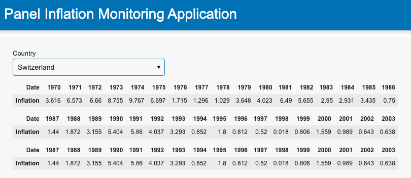
Figure 2: Displaying Tabular data (Image by Author).
Following a similar structure, we can then proceed to make a slider where the user can pick the range of years to examine and create a plot to visualize the country historical trend (Figure 3).
years_widget = pn.widgets.RangeSlider(name='Years Range', start=1970, end=2022, value=(1970, 2022), step=1)

def make_inf_plot(country, years):
    df = inf_df[country].loc[inf_df[country].index.isin(range(years[0], years[1]))]
    return df.hvplot(height=300, width=400, label=country + ' Overall Inflation')


bound_plot = pn.bind(make_inf_plot, country=country_widget, years=years_widget)
panel_app = pn.Column(years_widget, bound_plot)
panel_app.servable()
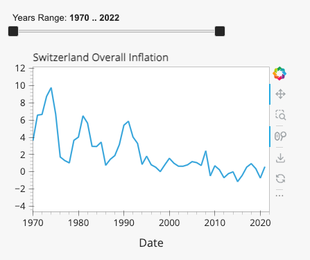
Figure 3: Overall Inflation Trend (Image by Author).
Now that we have been able to visualize the overall inflation data, we can then add a second plot where the user can choose if inspect the food or energy prices inflation trend (Figure 4).
type_plot_widget = pn.widgets.Select(name="Inflation Type", value="Food", options=["Food", "Energy"])

def make_type_plot(plt_type, country, years):
    if plt_type == "Food":
        df = food_df[country].loc[inf_df[country].index.isin(range(years[0], years[1]))]
        return df.hvplot(height=300, width=400, label=country + ' Food Inflation')
    else:
        df = energy_df[country].loc[inf_df[country].index.isin(range(years[0], years[1]))]
        return df.hvplot(height=300, width=400, label=country + ' Energy Inflation')

bound_plot = pn.bind(make_type_plot, plt_type=type_plot_widget, country=country_widget, years=years_widget)
panel_app = pn.Column(type_plot_widget, bound_plot)
panel_app.servable()
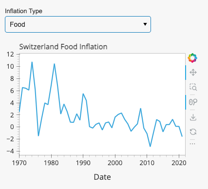
Figure 4: Food/Energy Inflation Trend (Image by Author).
Finally, we can also add an explorer widget on the dashboard in order to make it possible for the user to create its own charts (Figure 5).
hvexplorer = hvplot.explorer(inf_df)
pn.Column(
    '## Feel free to explore the entire dataset!', hvexplorer
).servable()
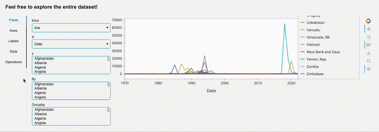
Figure 5: Explorer Widget (Image by Author).
Once created the full application and stored it in a pane_example.py file, we can then run the command below in order to visualize the results.
panel serve panel_example.py --autoreload --show
The application can then be converted into an HTML format using the following command:
panel convert panel_example.py --to pyodide-worker --out docs
After the conversion, it should then be possible to launch it with an HTTP server. The web page should then be available at the following link: http://localhost:8000/docs/panel_example.html
python3 -m http.server
Shiny for Python
Shiny was on open source library originally developed for R, that is now available also for Python users. It can be easily installed using the following command:
pip install shiny
Once imported the data, we can then work on our application, by first importing the necessary dependencies and then structuring the layout of the application. Specifically the following steps are adopted:
- We first create a title for the application.
- Design a sidebar containing a dropdown and a slider (to be used as inputs to populate the following plots).
- Output 2 plots next to the sidebar (to show the overall inflation trend for a country and its annual change in inflation).
- Add a final dropdown and plot at the end of the application (where users can inspect the food/energy prices inflation trend).
import pandas as pd
import numpy as np
import matplotlib.pyplot as plt
from shiny import ui, render, reactive, App

app_ui = ui.page_fluid(
    ui.h2("Python Shiny Inflation Monitoring Application"),
    ui.layout_sidebar(
        ui.panel_sidebar(
            ui.input_selectize("country", "Country",
                list(inf_df.columns)
            ),
            ui.input_slider("range", "Years", 1970, 2022, value=(1970, 2022), step=1),
        ),
        ui.panel_main(
            ui.output_plot("overall_inflation"),
            ui.output_plot("annual_change")
        )
    ),
    ui.input_selectize("type", "Inflation Type",
        ["Food", "Energy"]
    ),
    ui.output_plot("inflation_type")
)
Once defined the layout we can then proceed to create the different plots:
def server(input, output, session):

    @output
    @render.plot
    def overall_inflation():
        df = inf_df[input.country()].loc[inf_df[input.country()].index.isin(range(input.range()[0], input.range()[1]))]
        plt.title("Overall Inflation")
        return df.plot()

    @output
    @render.plot
    def annual_change():
        annual_change = inf_df[input.country()].diff().loc[inf_df[input.country()].index.isin(range(input.range()[0], input.range()[1]))]
        plt.title("Annual Change in Inflation")
        return plt.bar(annual_change.index, annual_change.values, color=np.where(annual_change>0,"Green", "Red"))

    @output
    @render.plot
    def inflation_type():
        if input.type() == "Food":
            df = food_df[input.country()].loc[inf_df[input.country()].index.isin(range(input.range()[0], input.range()[1]))]
            plt.title(input.country() + ' Food Inflation')
            return df.plot()
        else:
            df = energy_df[input.country()].loc[inf_df[input.country()].index.isin(range(input.range()[0], input.range()[1]))]
            plt.title(input.country() + ' Energy Inflation')
            return df.plot()


app = App(app_ui, server)
The application can then be launched locally using the following command (Figure 6):
shiny run --reload app.py
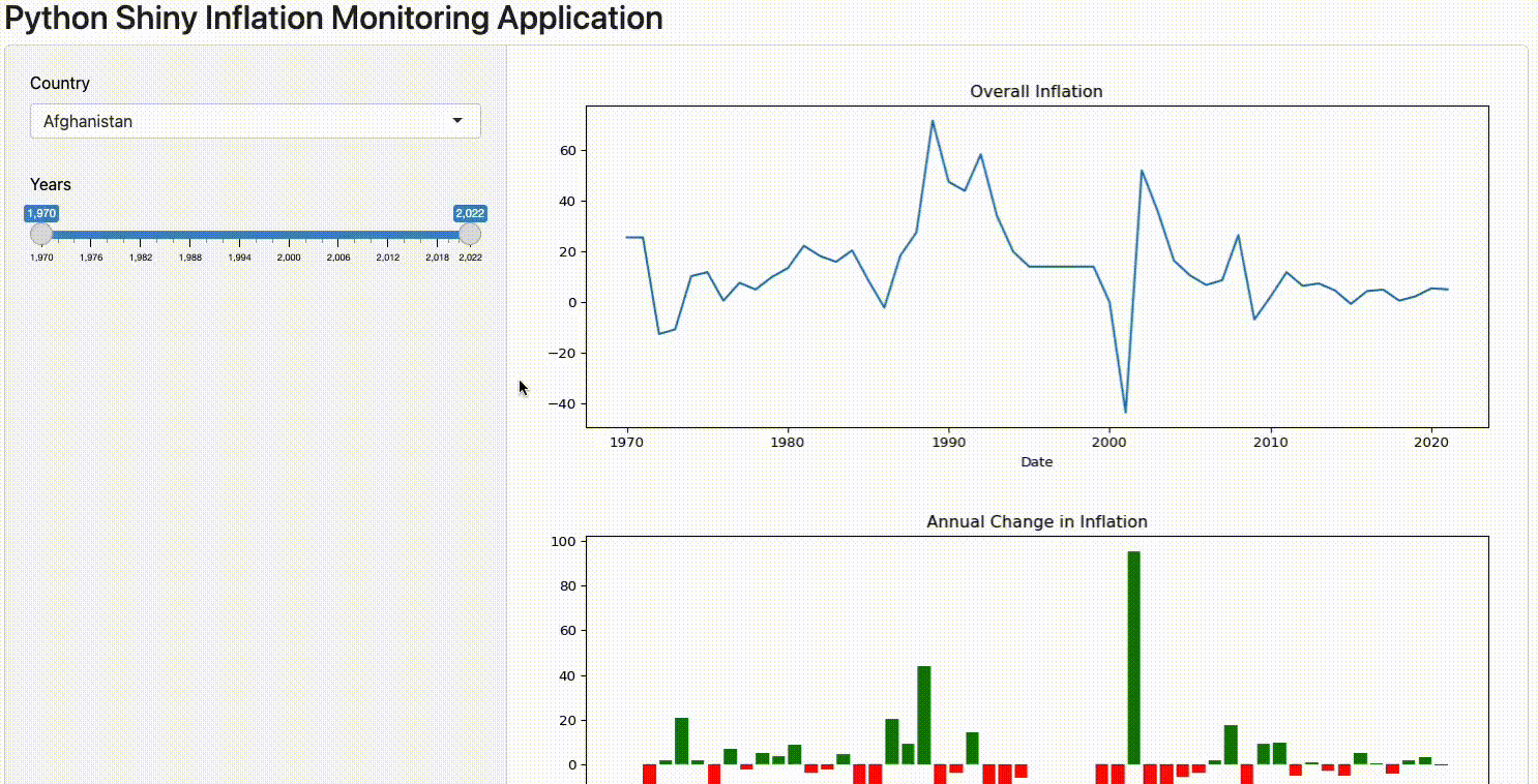
Figure 6: Shiny Application Example (Image by Author).
If interested in converting the code into HTML so that to share it on a webpage, we then need to first install shinylive and then use the following command (make sure to name your application app.py!).
pip install shinylive
shinylive export . docs
After the conversion, it should then be possible to launch the application with an HTTP server. The web page should then be available at the following link: http://[::1]:8008/
python3 -m http.server --directory docs --bind localhost 8008
PyScript
PyScript is a framework developed by Anaconda in order to make possible to write Python code directly into your HTML files. After importing the pyscript.js scripts, Python code can then be automatically executed and processed to render the results in your application.
All the HTML code needed in order to run our application is shown below. The Python code can then be just pasted between the <py-config> commands. After the <py-config> command, a div has also been added in order add a title to the application and get different input parameters for our plots (in the same way we had input parameters for our Panel and Shiny dashboards).
<html>
    <head>
    <title>Inflation Monitoring</title>
    <meta charset="utf-8">
    <link rel="stylesheet" href="https://pyscript.net/latest/pyscript.css" />
    <script defer src="https://pyscript.net/latest/pyscript.js"></script>
    </head>
    <body>

    <py-config>
        packages = ["pandas", "matplotlib", "numpy"]
    </py-config>

    <py-script>
    # TODO: Your Python Code Here
    </py-script>

    <div id="input" style="margin: 20px;">
        <h1> Pyscript Inflation Monitoring Application</h1>
        Choose the paramters to use: <br/>
        <input type="number" id="s_year" name="params" value=1970 min="1970" max="2022"> <br>
        <label for="s_year">Starting Year</label>
        <input type="number" id="e_year" name="params" value=2022 min="1970" max="2022"> <br>
        <label for="e_year">Ending Year</label>
        <select class="form-control" name="params" id="country">
            <option value="Switzerland">Switzerland</option>
            <option value="Italy">Italy</option>
            <option value="France">France</option>
            <option value="United Kingdom">United Kingdom</option>
        </select>
        <label for="country">Country</label>
    </div>

    <div id="graph-area"></div>
    </body>
</html>
In this case, we start by importing the libraries and defining a plot function to create the overall inflation trend plot and annual change. Using the js library we can then be able to get the input parameters specified in the HTML file and call our plotting function.
Finally, a proxy is created in order to check if the end users change over time any of the parameters, and if so automatically update their values stored in Python and the respective plots.
import js
import pandas as pd
import numpy as np
from io import StringIO
import matplotlib.pyplot as plt
from pyodide.ffi import create_proxy

def plot(country, s_year, e_year):
    df = inf_df[country].loc[inf_df[country].index.isin(range(s_year, e_year))]
    annual_change = inf_df[country].diff().loc[inf_df[country].index.isin(range(s_year, e_year))]
    fig, (ax1, ax2) = plt.subplots(2)
    fig.suptitle('Overall inflation and annual change in ' + country)
    ax1.set_ylabel("Inflation Rate")
    ax2.set_ylabel("Annual Change")
    ax1.plot(df.index, df.values)
    ax2.bar(annual_change.index, annual_change.values, color=np.where(annual_change>0,"Green", "Red"))
    display(plt, target="graph-area", append=False)

s_year, e_year = js.document.getElementById("s_year").value, js.document.getElementById("e_year").value
country = js.document.getElementById("country").value
plot(str(country), int(s_year), int(e_year))


def get_params(event):
    s_year, e_year = js.document.getElementById("s_year").value, js.document.getElementById("e_year").value
    country = js.document.getElementById("country").value
    plot(str(country), int(s_year), int(e_year))

ele_proxy = create_proxy(get_params)

params = js.document.getElementsByName("params")
for ele in params:
    ele.addEventListener("change", ele_proxy)
Once finished developing the application and storing it in a .html file, we can then immediately launch it by opening the file using a web browser (Figure 7).
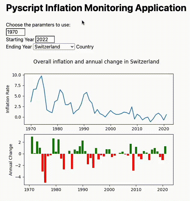
Figure 7: PyScript Example Application (Image by Author).
Deployment
In order to deploy our applications on the web, it might be necessary to store our input data alongside the application in a single file (e.g. after the conversion from Python to HTML it could in fact not be possible anymore to load the data from XLSX). One possible way to do this is to:
- Export the 3 dataframes originally imported into CSV files.
- Open the CSV files one at the time and paste the whole content in a variable (as shown below).
- Use this setup in the same file as the rest of your application (instead of the import_data function).
from io import StringIO

inf_df = """TODO: PASTE YOUR CSV FILE HERE"""

csvStringIO = StringIO(inf_df)
inf_df = pd.read_csv(csvStringIO, sep=",").set_index('Date')
Using this setup and converting the Panel and Python Shiny applications to HTML code as explained above it can then be possible to host your application on the web without needing to pay for any server.
One simple approach in order to do this, is using GitHub pages and adding our project files to an online repository. More information about GitHub pages is available here.
Conclusion
As part of this article we explored 3 different options which can be used in order to share your Python applications on the web without having to pay for any service management. Although, we also saw that taking this approach has some inherent limitations and could therefore not be the best option when designing more complex applications or working with large amounts of data.
If interested instead in showcasing your Machine Learning projects online (without needing a server architecture), Tensorflow.js and ONNX could be two great solutions for your needs.
Bibliography
[1] The World Bank, A Global Database of Inflation. Accessed at: https://www.worldbank.org/en/research/brief/inflation-database. License: Creative Commons Attribution 4.0 International license (CC-BY 4.0).
Contacts
If you want to keep updated with my latest articles and projects follow me on Medium and subscribe to my mailing list. These are some of my contacts details:
